Dokan Zaman
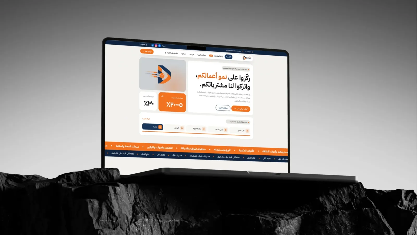
A clearer digital experience for modern business supply. A UI/UX case study focused on making Dokan Zaman’s broad product range and procurement services easier to explore, understand, and act on.
View live site (opens in a new tab)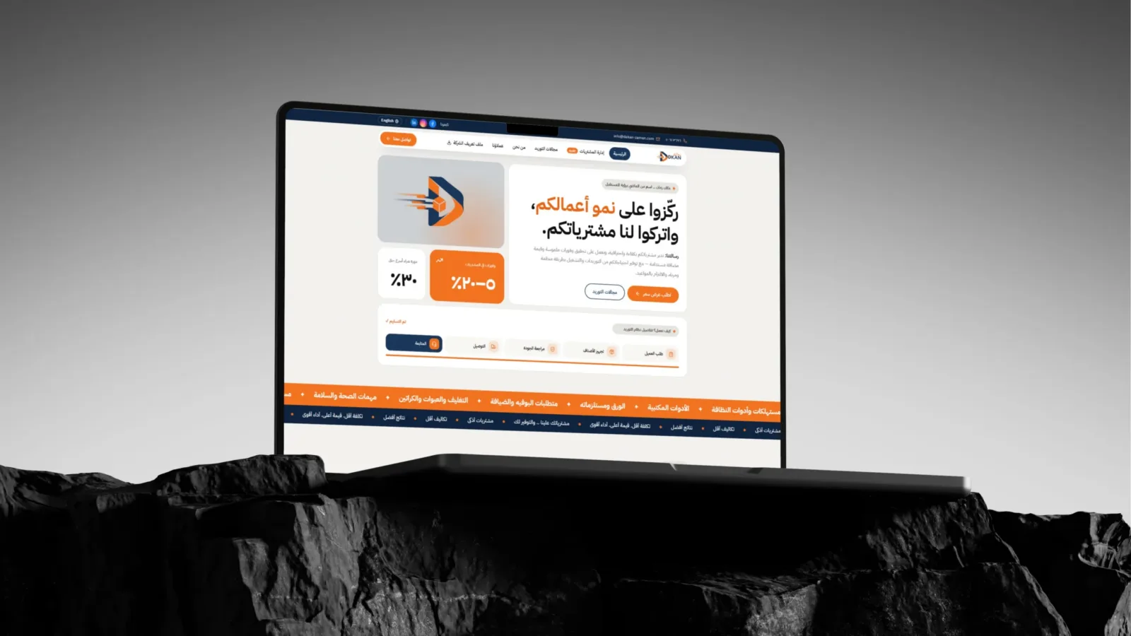
- Client
- Dokan Zaman General Supplies
- Type
- Website / Digital Experience
- Services
- UI/UX Design · Web Design · Responsive Experience
The challenge
A wide-ranging offer needed a simpler, more usable digital experience.
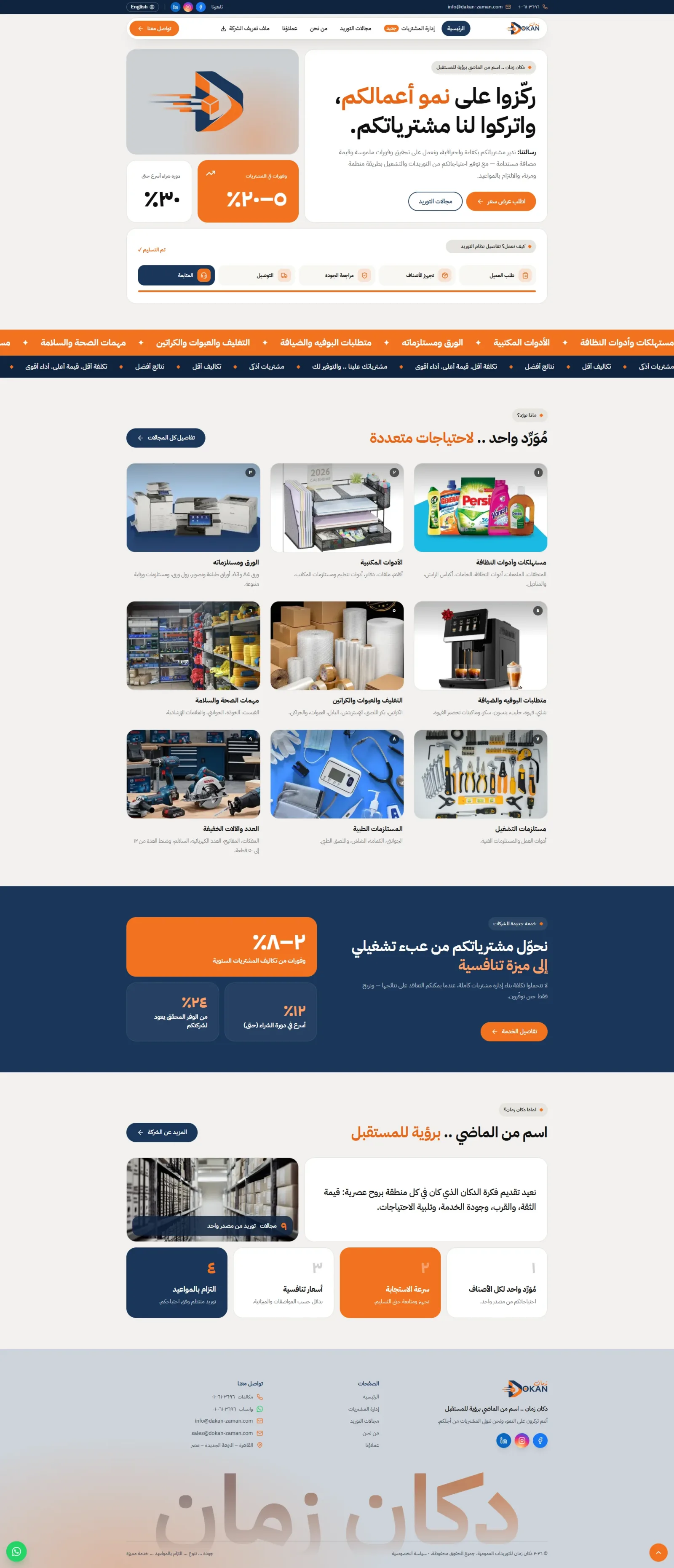
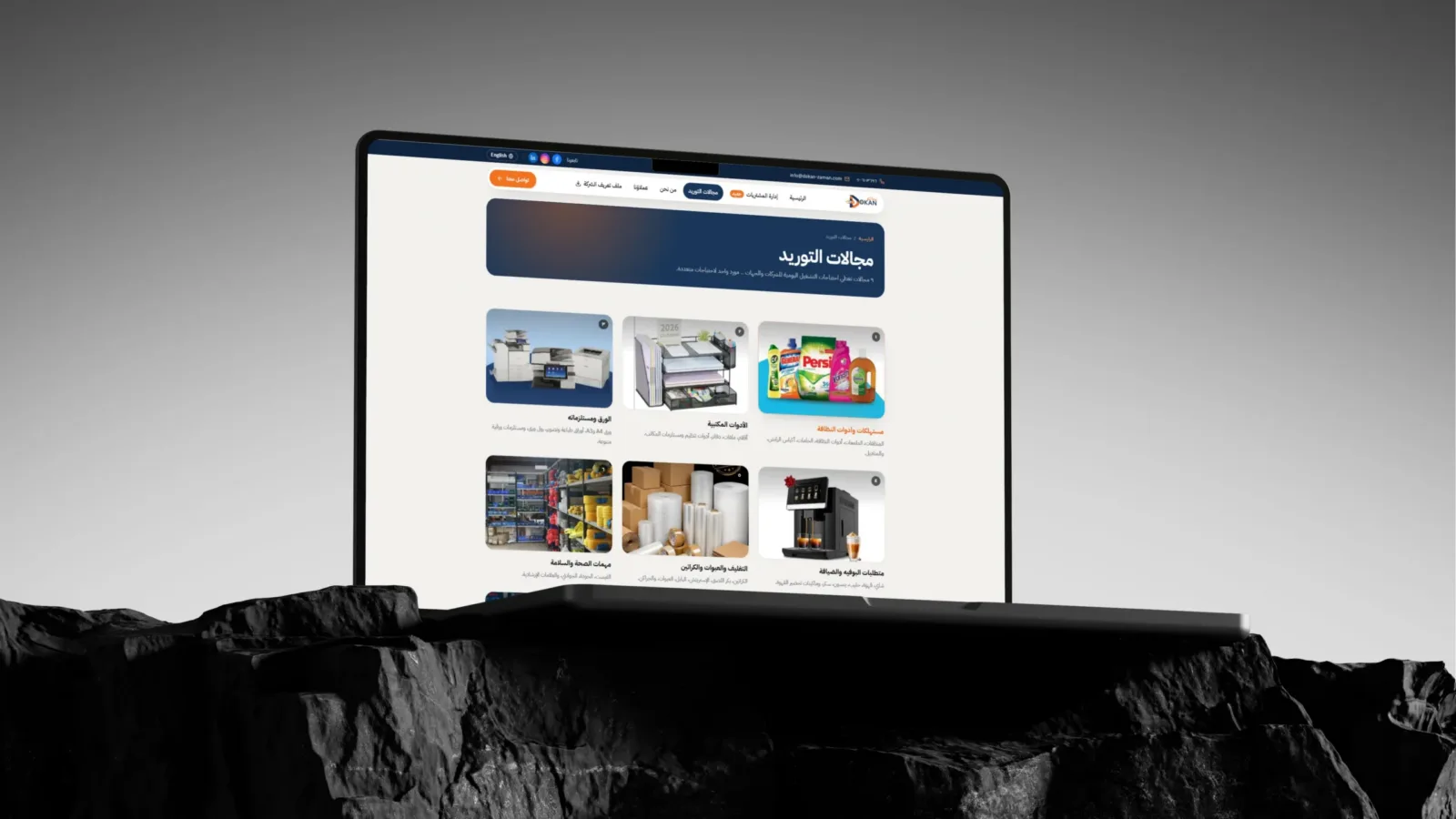
Nine supply categories made it important to help visitors find the right products without feeling overwhelmed.
Procurement services sat alongside the product offer, so visitors needed a clearer way to understand what the company could manage for them.
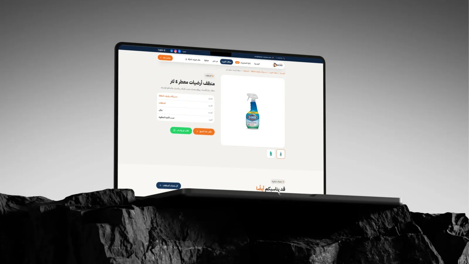
Key actions, exploring categories, learning about services, and requesting a quote, needed to be easy to spot and use across screen sizes.
The journey
-
AUDIT THE EXPERIENCE
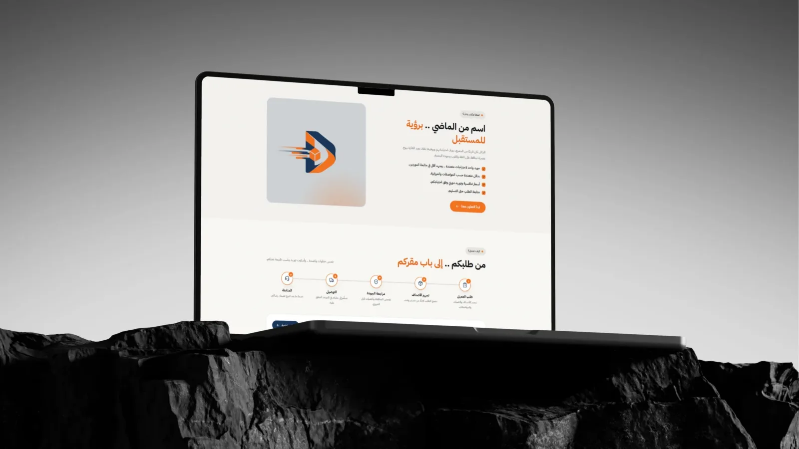
We reviewed the existing content and mapped the main visitor needs: find a supply category, understand the service, or get in touch.
-
CLARIFY THE STRUCTURE
We organized the experience around two clear paths: browse the nine supply categories or explore managed procurement services.
-
DESIGN FOR SCANNING
We used stronger content hierarchy, concise section headings, category imagery, and cards to make key information easier to scan.
-
MAKE THE NEXT STEP CLEAR
MAKE THE NEXT STEP CLEAR We gave quote requests and contact options visible placements, helping visitors move from browsing to taking action.
The work
Branding & system
Outcome
A more usable way to discover, understand, and connect.
The experience gives business buyers clearer paths through Dokan Zaman’s categories and services, with quote and contact options close at hand.
CLOSING
Dokan Zaman
A name from the past, made easier to navigate for today.